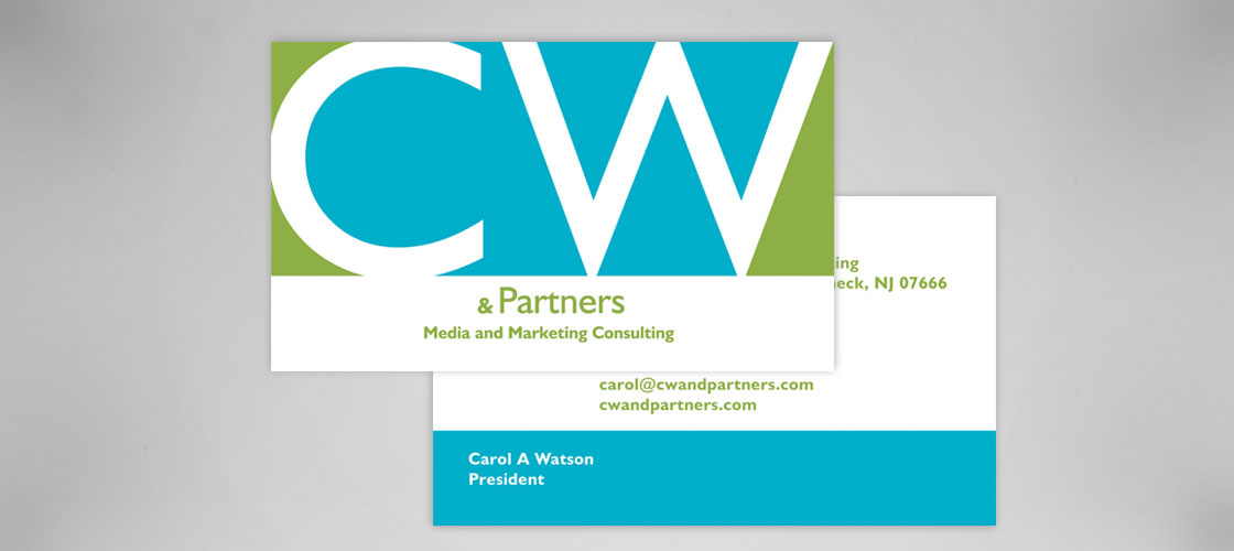
CW & Partners
Engaging A Diverse Market
THE PROJECT
CW & Partners, a privately held media and marketing services firm had a mission to use their strategic partnerships in engaging the multicultural market. I wanted to create an iconic treatment that could be used as a mark or stamp and later repurposed as a graphic element on its own. Inspired by the strong geometric "W" in Eric Gill's Humanist font, I developed a typographic mark that emphasized the idea of the multiple negative parts of the each character worked to a create a whole logotype. Depending on application, the colors that make up the mark could be interchanged with photography.


